
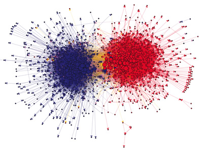
Visual representation of links among political blogs during the 2004 election season. Red and blue dots represent conservative and liberal blogs, respectively; orange links go from liberal to conservative, and purple ones from conservative to liberal.
I continue to be fascinated by the way that modern software can represent data visually, often creating remarkable abstract art as a by-product.
The image above is from a paper titled "The Political Blogosphere and the 2004 U.S. Election: Divided They Blog," by Lada Adamic of HP Labs and Natalie Glance at Intelliseek Applied Research Center. (Tip of the hat to Visual Complexity, which has many other wonderful examples of data visualization "art.")
The researchers created a database of 676 blogs judged to be liberal in political outlook and 659 judged to be conservative. The figure from their paper presented above shows the links to other blogs that were found on the sites' blogrolls (not in text citations). It was created using a computer visualization and analysis tool. The size of each blog indicates the number of other blogs that link to it.
Adamic and Glance report:
[The figure] shows the unmistakable division between the liberal and conservative political (blogo)spheres. In fact, 91% of the links originating within either the conservative or liberal communities stay within that community. An effect that may not be as apparent from the visualization is that even though we started with a balanced set of blogs, conservative blogs show a greater tendency to link. 84% of conservative blogs link to at least one other blog, and 82% receive a link. In contrast, 74% of liberal blogs link to another blog, while only 67% are linked to by another blog.So you might conclude that conservative bloggers tend to be more of a community and liberal bloggers tend more to be rugged individualists. Or you might not. Or you might just admire the pattern they collectively made.
No comments:
Post a Comment